My board layout is QWERTY-based, most of the keys are in their familiar places. Yet some of them, especially those on the navigation layer, are moved. Why?
In this post
I will try to recollect my thoughts on that.
Backspace/Delete
Backspace/Delete
key is located in the top right corner, above Enter, about the same spot as in
regular boards.
In the
data-entry scenarios, i.e. in QWERTY and Numbers layers, that button acts as
Backspace. The reason is while typing I most likely need to remove the last
entered character or word (with usual combo Ctrl+Backspace.)
In
navigation/editing layers that button acts as Delete. I noticed when I edit text most often I navigate to the
beginning of the text I want to delete, then use Delete key. So it is logical
to change the behavior of that key from Backspace to Delete when I use the
navigation layer. I just drop my right thumb on the corner button, use three
middle fingers to get to the starting point. Then I press Delete with my pinkie
without releasing the thumb.
Another
reason is I still need both Backspace and Delete keys, so it has to be placed
somewhere. There is no available spot in the default layer, that meant it
should go to some other layer(s). I could put Delete key on the key adjacent to
Backspace ("P" in QWERTY layer.) But that still would be on
navigational layer. I preferred to keep the same key for both operations
Backspace and Delete. That means the pinkie needs to hit the same key for the
"delete" operation, but the direction of that operation changes
depending on whether I drop my thumb on the corner key or hold it up.
Symmetrical Navigation Layers
I am
right-handed, yet my right hand is no longer capable to do all the work alone,
I have to involve the left one more and more. I started using the left-handed
mouse and then trackball, and felt a relieve in my right wrist. So I made two
layers for navigation - one for each hand.
(Thanks to
QMK and Jack Humbert's Planck keyboard I learned how to use three-state
modifiers. This way two thumb-controlled buttons allow to have four layers in a
easy way.)
This way I
can scroll through the text or spreadsheet with my left hand, and write notes
or check off something in a paper form with my right hand (I still write with
my right hand, haven't learned how to do that with the left one yet.)
Tab/Enter
This is a
continuation of the symmetrical navigation layers' idea. While going trough
some text or a list/controls/spreadsheet I may need to hit Enter. When I use my
right hand, there is a standard button. But if I use my left hand for
navigation that conventional Enter button is too far away.
Turning Tab
into Enter temporarily while in Navigation layer resolves the issue.
Also it is
performed with pinkies on both sides, so it is easy to remember.
Control, Win, Alt, Menu
These keys
are located in their usual places.
That is very
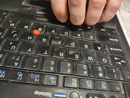
close to what they are located in my favorite conventional Thinkpad keyboard:
Controls are
pressed with pinkies, Win and Menu - with the ring fingers, and Alts on both
sides - with the middle fingers:
On the right
side Alt and Menu follow the key columns used by the middle and the ring
fingers almost precisely.
On the left
side that is not so obvious because of the row stagger, but they are located
right under the middle and the ring finger too.
So with my
staggered column design those keys got their familiar positions.
Control keys
are a bit of exception. They keep their corner spots, but are on the bottom row
with ZXCVB letters. The reason is the same - it is pretty close to the regular
keyboard layout, are within reach of pinkies. Also with my boards Controls can
be pressed by the palm edge, or by curling pinkie in (instead of using finger
tips.) Sometimes that is more comfortable to do, the lateral palm move/turn is
avoided, replaced with axial (is that the right term) hand rotation.
As for those
keys' action - it is immutable, remains the same on all layers (except for
Plover where they make no sense at all.)
One may
notice some other keys get assigned to work as Alt in the Numbers layer, that's
a leftover from some experiments. Those positions are handy, but not really
needed, may be removed/replaced in the future key map revisions.
Page Up, Page Down
Again, these
keys extend the idea of symmetrical navigation layers. Oftentimes I need to
scroll through some long files, web pages and would like to do that with either
hand.
I hold a
thumb on the corner key and use index finger of the same hand to press page up
or page down.
Two points
about these keys location:
1. Page
Up/Down compete with Home and End in the navigation layers.
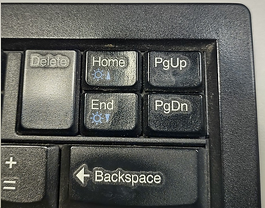
In Thinkpad
keyboard Page Up and Down are located with cursor arrows block. The icons on
the keys are not telling their action, but they are PgUp and PgDn.
Home and End
are in the top right corner with a repeated PgUp and PgDn
So it was
really a matter of preference which keys to put where. I opted with PgUp, PgDn
to be in the innermost column pressed with the index fingers. May because they
are used less than Home/End, it could be the other way around.
2. Which row to put them on, the top two or
the bottom?
This layout
was developed with a few physical keyboards, mostly with Dactyl-Manuform
versions. For those keyboards it was move convenient to have them on the bottom
two rows, i.e. Page Up on G and H keys, and Page Down on B and N.
With ThumbUp!
design the thumb keys got a bit closer to the bottom row, so pressing Page Down
became less comfortable. Those B and N keys are the two least places in the
whole board, they are ok to be hit once while typing, but pressing it
repeatedly (as required with Page Down) is not pleasant.
So in the
current key map revision Page Up and Page Down are moved to the top two rows,
even if Page Up may require extending the index finger a bit farther.


Comments
Post a Comment